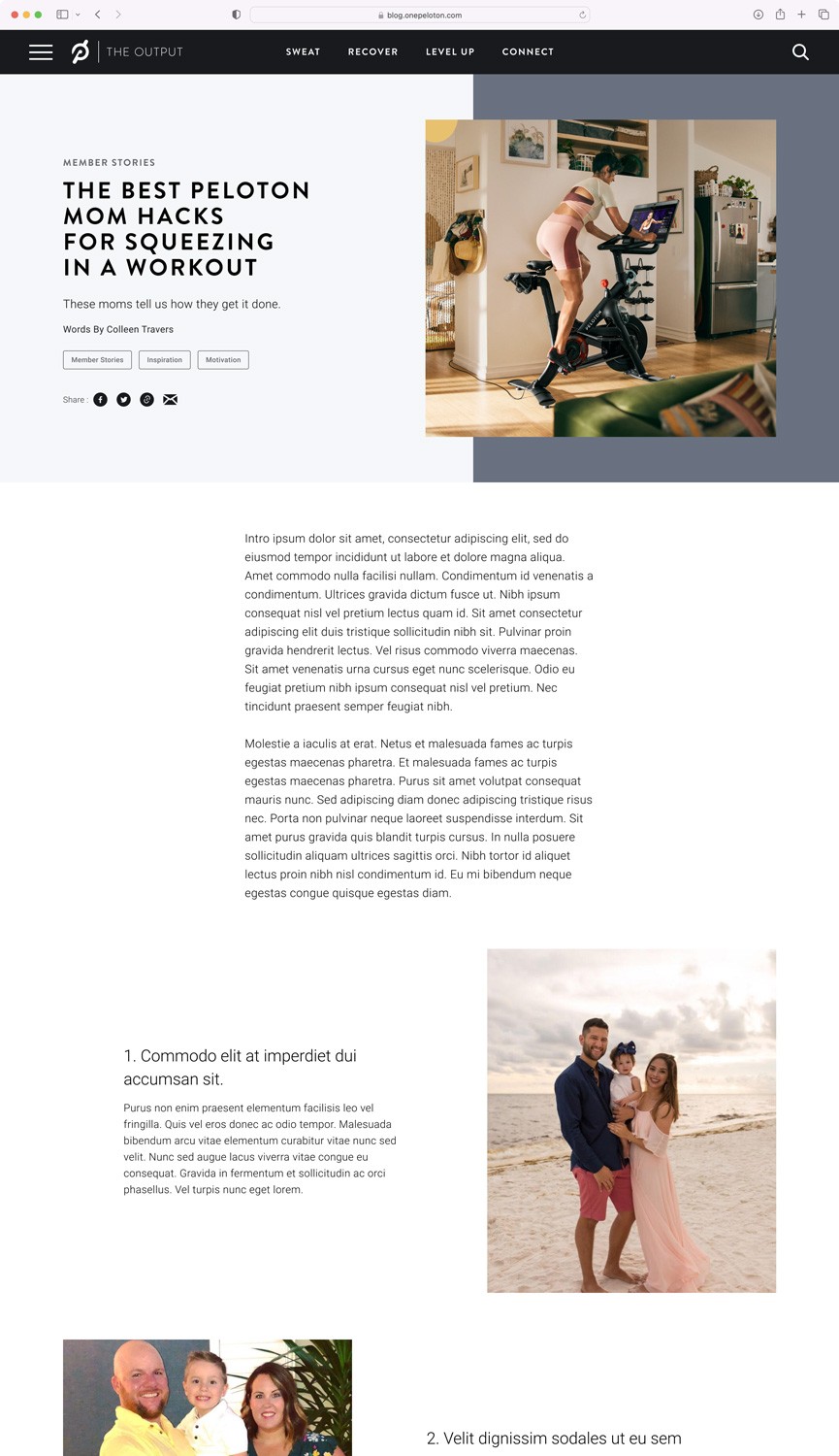
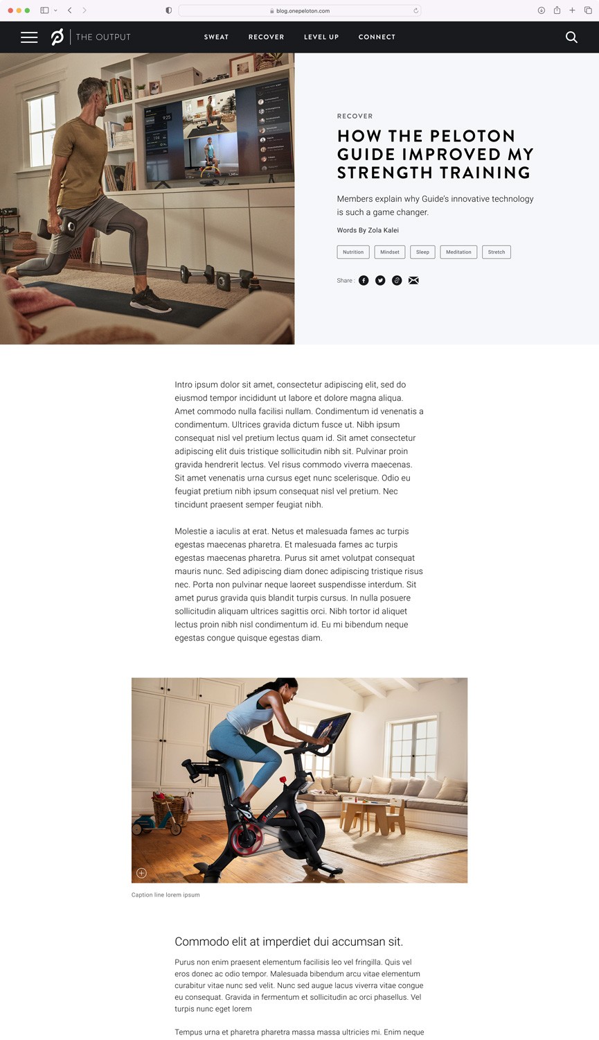
The Output had outdated peloton branding so it felt disconnected from their parent site. The blog had lots of articles but no clear organization. As for experience, it lacked proper way-finding and methods of content discovery.
The Lead UX designer on the Kettle team worked out the problems above in wireframes. After the wireframes were complete, I was responsible for applying UI to them.

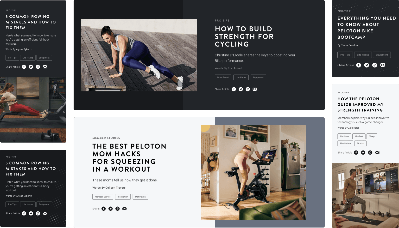
It was my responsibility to apply the Peloton color, type styles, shape treatment, and photography to the new blog design. I worked with the team at Kettle and Peloton to find ways to also expand the system. We expanded the system with new hero treatments, type treatments, and new web components.


